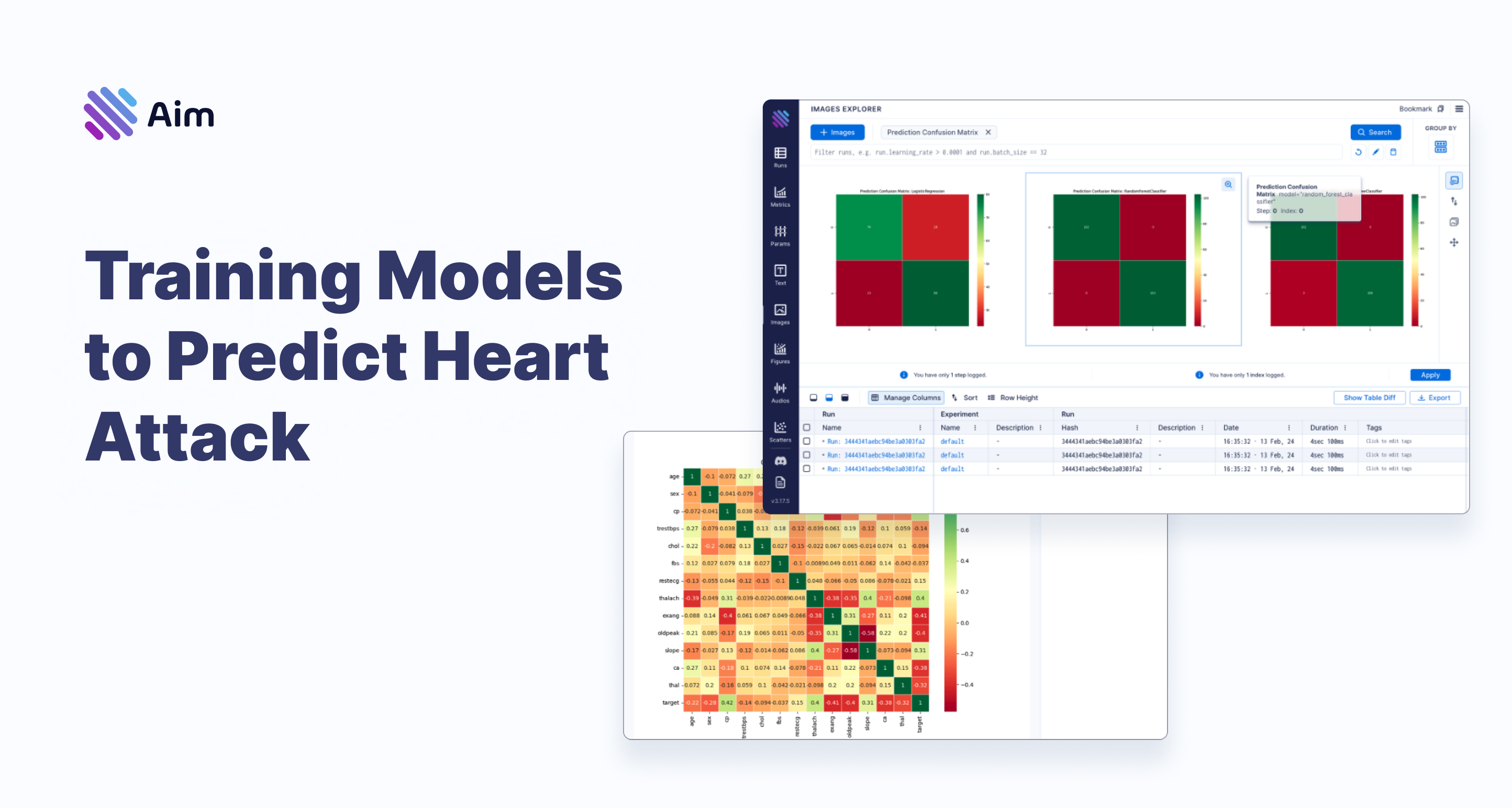
In today's blog post, we'll explore heart attack prediction using the Heart Attack Prediction dataset. Our aim is to understand the key factors behind heart attacks with Machine Learning algorithms. We're going also to use the Aim open-source experiment tracking tool, renowned for its great UI and lightning-fast insights.
Let's dive straight into the action by setting up our environment and importing the essential libraries:
import pandas as pd
from sklearn.ensemble import RandomForestClassifier
from sklearn.linear_model import LogisticRegression
from sklearn.metrics import accuracy_score, classification_report, confusion_matrix
from sklearn.model_selection import train_test_split
from sklearn.preprocessing import StandardScaler

import matplotlib.pyplot as plt
import seaborn as sns

from aim import Image, Run
Let's dive into the dataset. We'll start by loading it to see the main features:
df = pd.read_csv("heart.csv")
df.head()
This dataset gives us key information on heart health, with the "target" column indicating a heart attack occurrence (1) or absence (0). Here are the dataset's columns briefly:
- age: Age of the individual
- sex: Gender of the individual (1 for male, 0 for female)
- cp: Chest pain type
- trestbps: Resting blood pressure
- chol: Serum cholesterol level
- fbs: Fasting blood sugar level
- restecg: Resting electrocardiographic results
- thalach: Maximum heart rate achieved
- exang: Exercise-induced angina (1 for yes, 0 for no)
- oldpeak: ST depression induced by exercise relative to rest
- slope: Slope of the peak exercise ST segment
- ca: Number of major vessels colored by fluoroscopy
- thal: Thalassemia
- target: Level of heart attack (0.1 for lesser and 0.9 for stronger)
Now, armed with this understanding, let's kickstart our Aim run to track our discoveries:
run = Run()It's as simple as that! Let's begin by logging some key insights about our dataset into our Aim run:
run["dataset_info"] = {
    "name": "Heart Attack Prediction",
    "features": df.describe().to_dict(),
}
Easy, isn't it? But as they say, simplicity often conceals complexity, and we're just scratching the surface of our exploration.
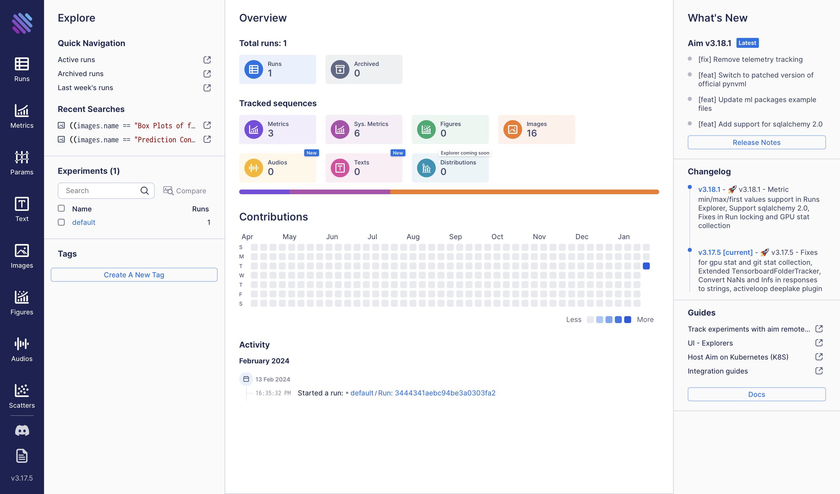
To observe these and the future metadata that we will track, let’s execute the following command:
aim upThe resulting view will provide us with:
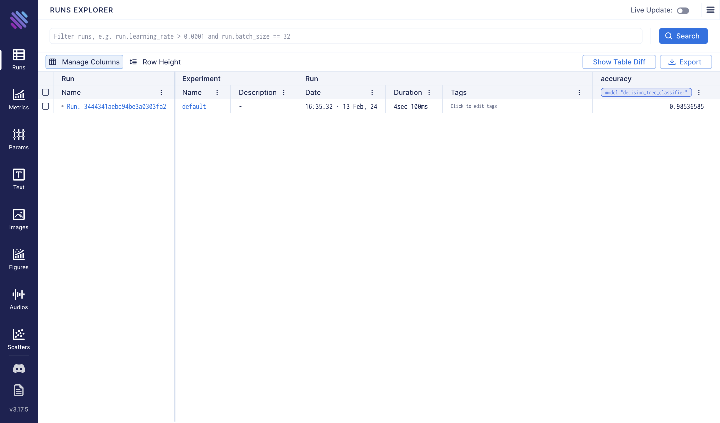
And by navigating to the Runs page we will see our newly created single run.
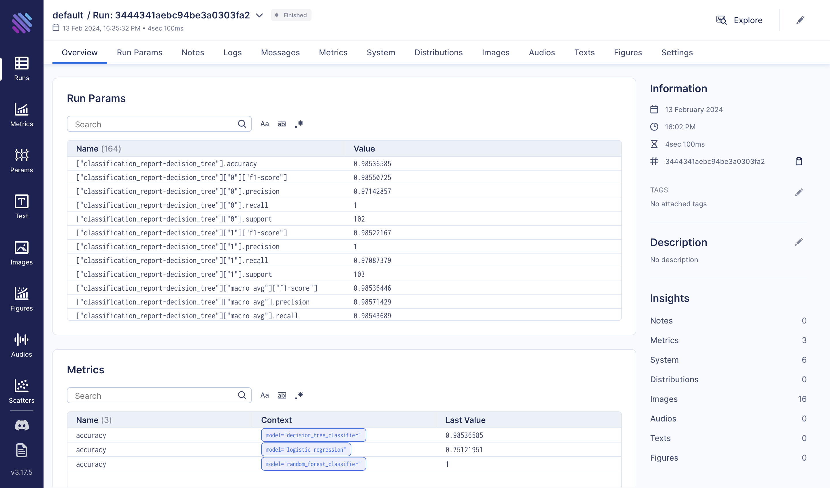
Click on the run name/hash to see the details of this run:
Exploratory Data Analysis
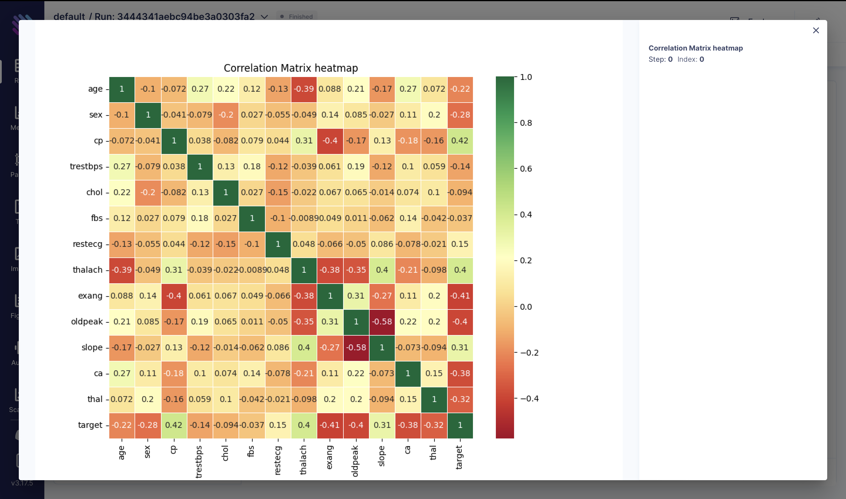
Upon a preliminary examination of the data, let's delve into our first qualitative analysis to explore the correlations among various metrics:
correlation_matrix = df.corr()
fig = plt.figure(figsize=(10, 8))
sns.heatmap(correlation_matrix, annot=True, cmap="RdYlGn", linewidths=0.5)
plt.title("Correlation Matrix Heatmap")
aim_img = Image(fig)
run.track(aim_img, name="Correlation Matrix heatmap")
We've generated a correlation matrix heatmap representing the correlation coefficients between different features in the heart attack dataset. Each cell contains the correlation coefficient between the corresponding row and column variables. Here are some key observations:
Positive Correlations:
- cp (Chest Pain Type) correlates positively with thalach (Maximum heart rate achieved) and slope.
- thalach correlates positively with slope.
Negative Correlations:
- age correlates negatively with thalach.
- sex correlates negatively with the target variable.
Strong Correlations:
- The absolute correlation coefficient between cp and the target is relatively high (0.42), indicating a moderate positive correlation.
- The absolute correlation coefficient between thalach and the target is also relatively high (0.40).
Other Observations:
- exang (Exercise induced angina) exhibits a strong negative correlation with thalach.
- oldpeak (ST depression induced by exercise relative to rest) correlates negatively with thalach.
Correlation coefficients range from -1 to 1, where 1 indicates a perfect positive correlation, -1 indicates a perfect negative correlation, and 0 indicates no correlation.
Next, let's visualize the distribution of the target variable and track it in Aim:
It would also be interesting to see how is the target variable distributed and again track it in Aim:
fig = plt.figure(figsize=(8, 6))
sns.histplot(df["target"], kde=True, color="skyblue", bins=20)
plt.title("Distribution of Target Variable")
plt.xlabel("Target")
plt.ylabel("Frequency")

aim_img = Image(fig)
run.track(aim_img, name="Distribution of Target Variable")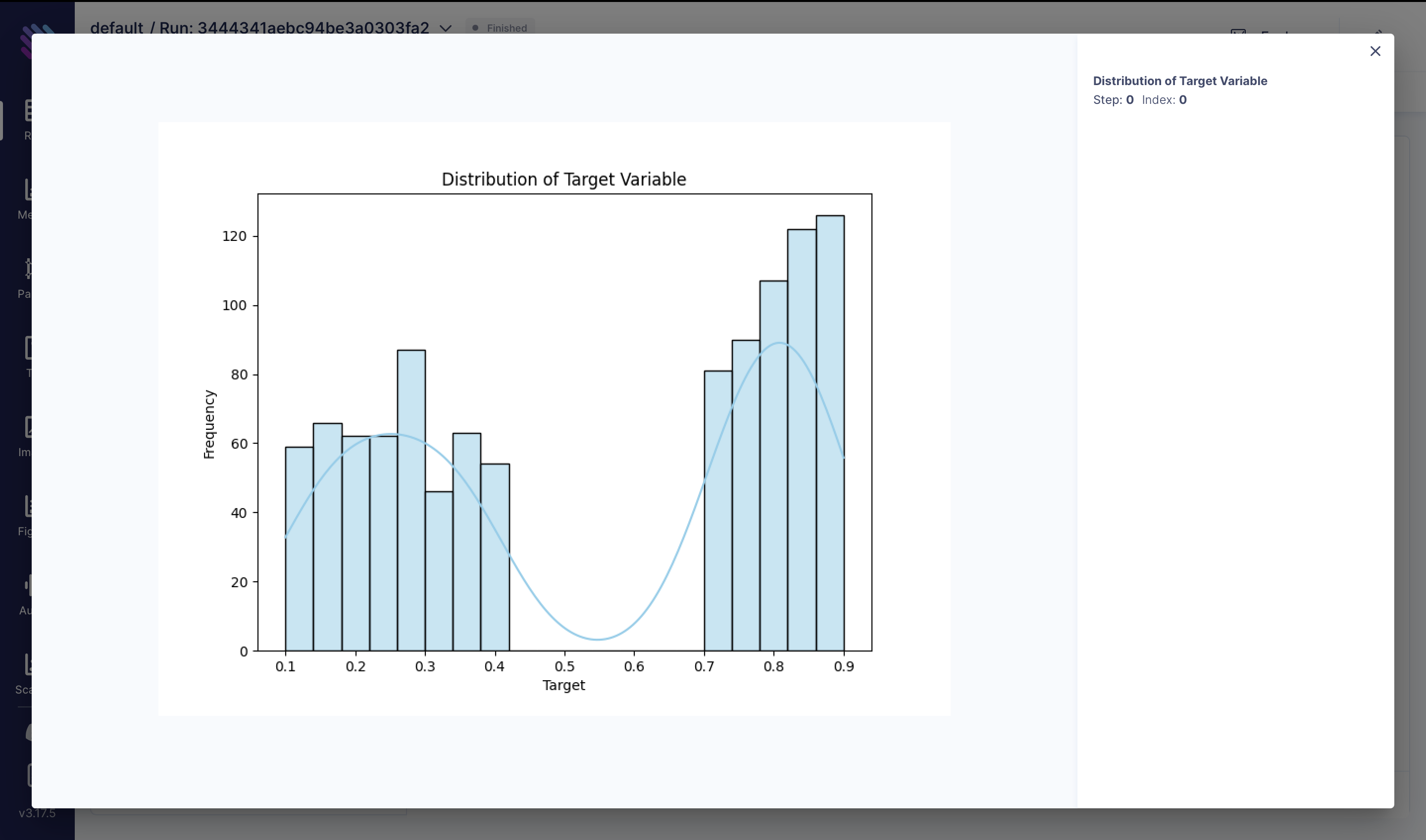
Also let’s plot the distribution of the features such as age, trestbps, chol, thalach and oldpeak that are gonna help us predict the target value:
numerical_features = ["age", "trestbps", "chol", "thalach", "oldpeak"]

for i, feature in enumerate(numerical_features, 1):
    fig = plt.figure(figsize=(10, 8))
    sns.boxplot(x=df[feature], color="skyblue")
    aim_img = Image(fig)
    run.track(aim_img, name=f"Box Plots of {feature}")
The centre of distribution chol & oldpeak is positively skewed, because the whisker and half-box are longer on the right side of the median than on the left side. Distribution of trestbps is approximately symmetric, because both half-boxes are almost the same length. It’s the most concentrated distribution because the interquartile range. The centre of distribution thalach & age is negatively skewed because the whisker and half-box are longer on the left side of the median than on the right side.
To check out the boxplots of each feature we can use the Images Explorer:

Now let’s normalize our features and check out their importance and track everything on Aim, starting with Impact of Age Categories on Heart Attack Risk:
df["target"] = df["target"].apply(lambda x: 1 if x >= 0.5 else 0)

df["age_category"] = pd.cut(df["age"], bins=[29, 45, 60, 100], labels=["Young", "Middle-aged", "Senior"], right=False,)
fig = plt.figure(figsize=(10, 6))
sns.countplot(x="age_category", hue="target", data=df, palette="viridis")
plt.title("Impact of Age Categories on Heart Attack Risk")
plt.xlabel("Age Category")
plt.ylabel("Count")
plt.legend(title="Heart Attack", labels=["No", "Yes"])
aim_img = Image(fig)
run.track(aim_img, name="Impact of Age Categories on Heart Attack Risk")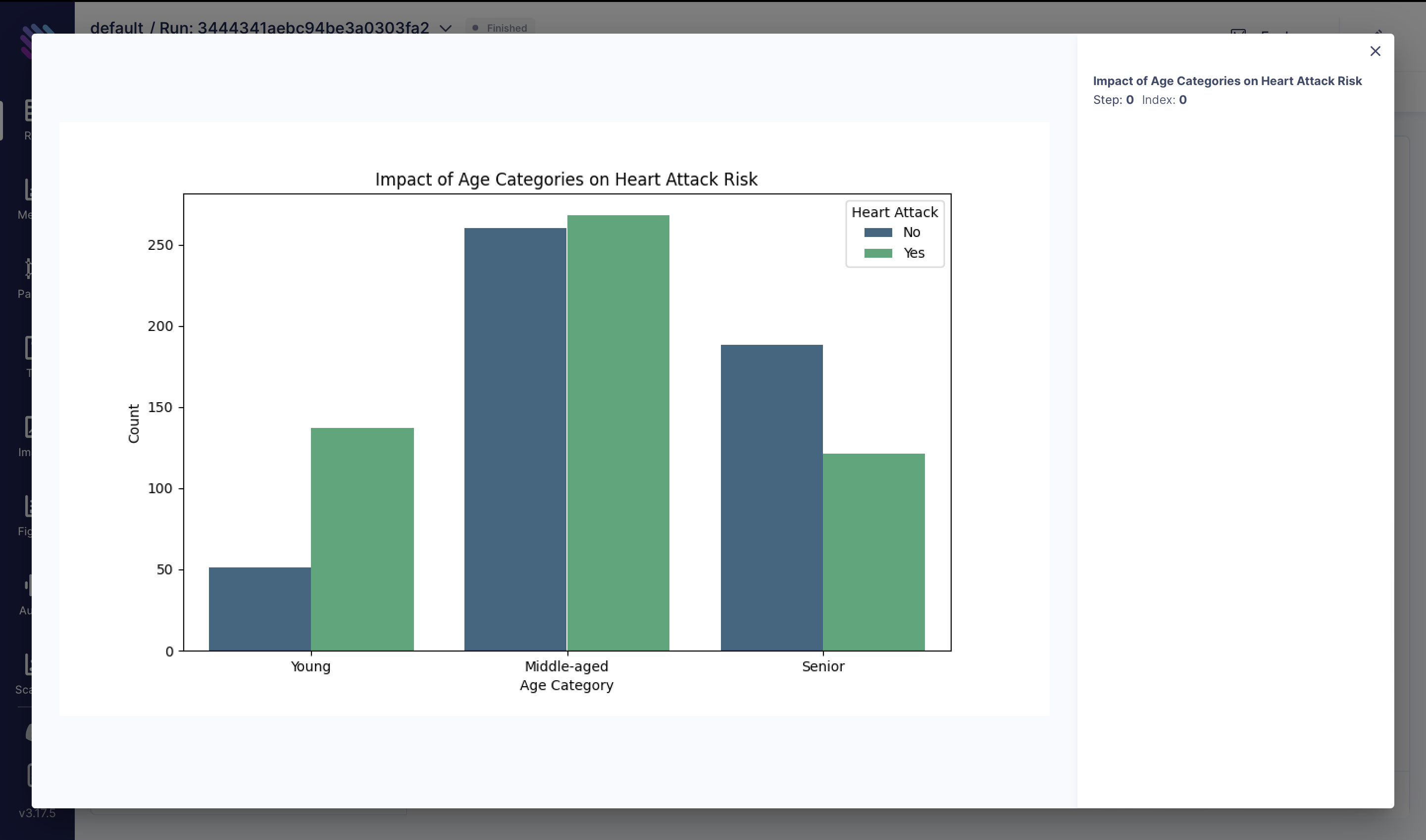
Understanding the combined effect of blood pressure (trestbps) and cholesterol (chol) levels on heart attack risk is crucial. We computed the total cardiovascular risk by summing these two variables. The box plot below illustrates the distribution of total cardiovascular risk among individuals with and without heart attacks:
df["total_risk"] = df["trestbps"] + df["chol"]
fig = plt.figure(figsize=(10, 8))
sns.boxplot(x="target", y="total_risk", data=df)
plt.title("Impact of Total Cardiovascular Risk on Heart Attack")
aim_img = Image(fig)
run.track(aim_img, name="Impact of Total Cardiovascular Risk on Heart Attack")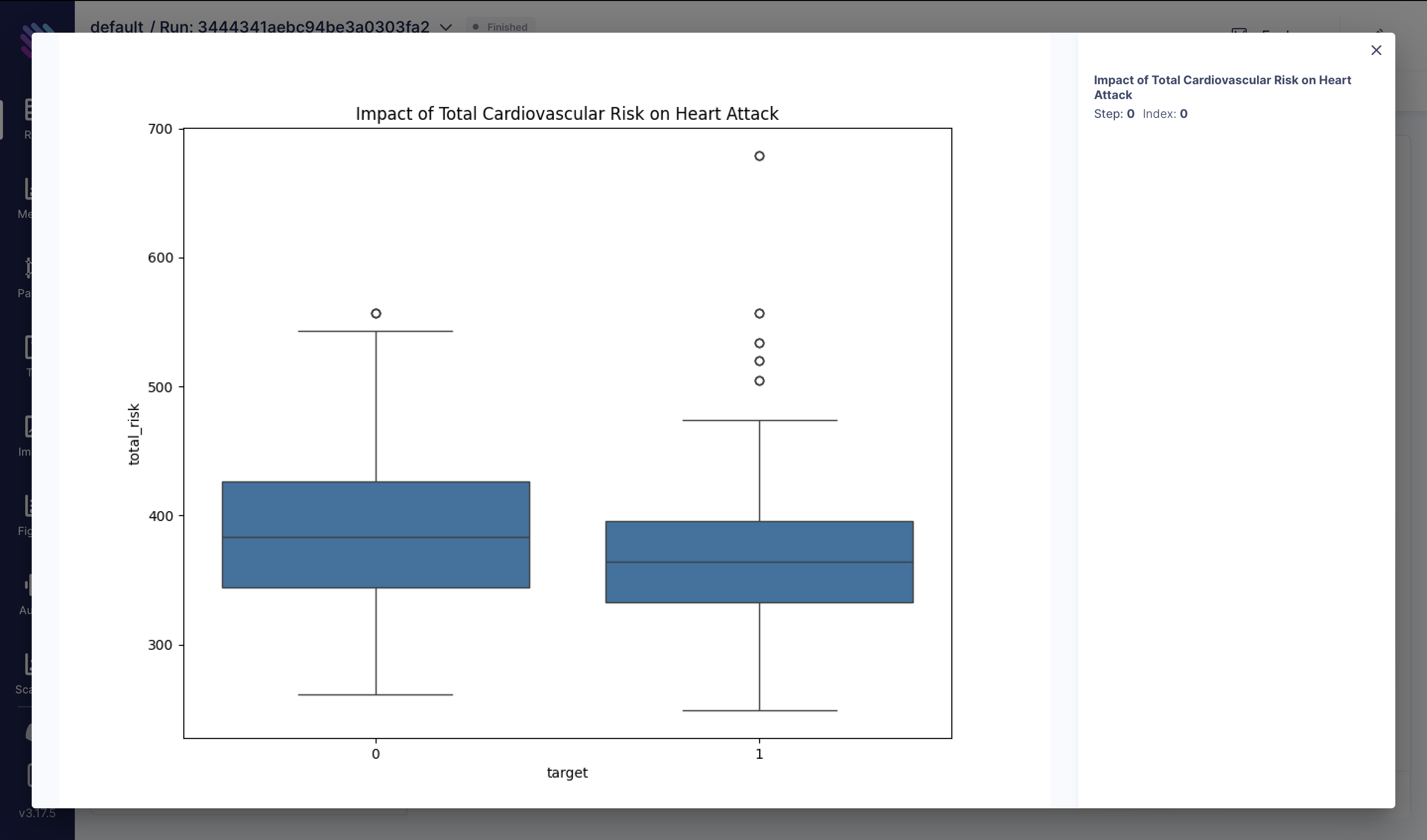
Exercise-induced angina, characterized by chest pain during physical exertion, could be a significant indicator of heart health. In this visualization, we explore how the presence of exercise-induced angina, coupled with maximum heart rate achieved (thalach), correlates with the occurrence of heart attacks:
df["exercise_angina"] = (df["exang"] == 1) & (df["thalach"] > 150)
fig = plt.figure(figsize=(10, 8))
sns.countplot(x="exercise_angina", hue="target", data=df)
plt.title("Impact of Exercise-induced Angina on Heart Attack")
aim_img = Image(fig)
run.track(aim_img, name="Impact of Exercise-induced Angina on Heart Attack")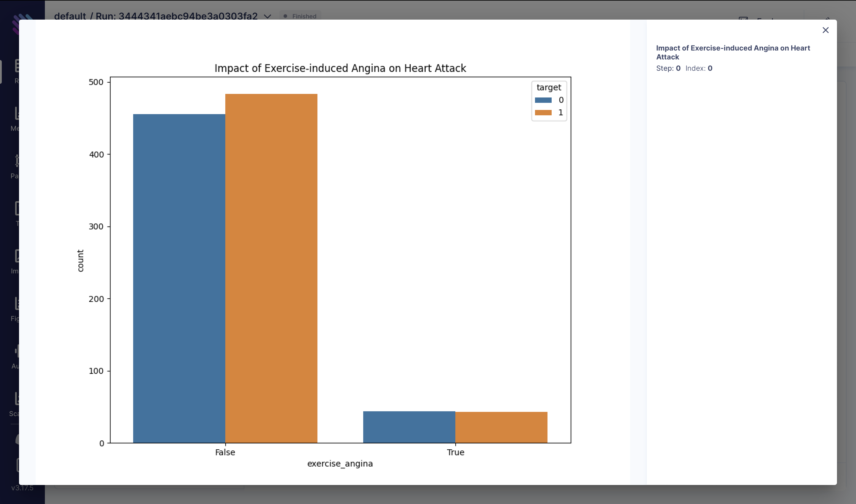
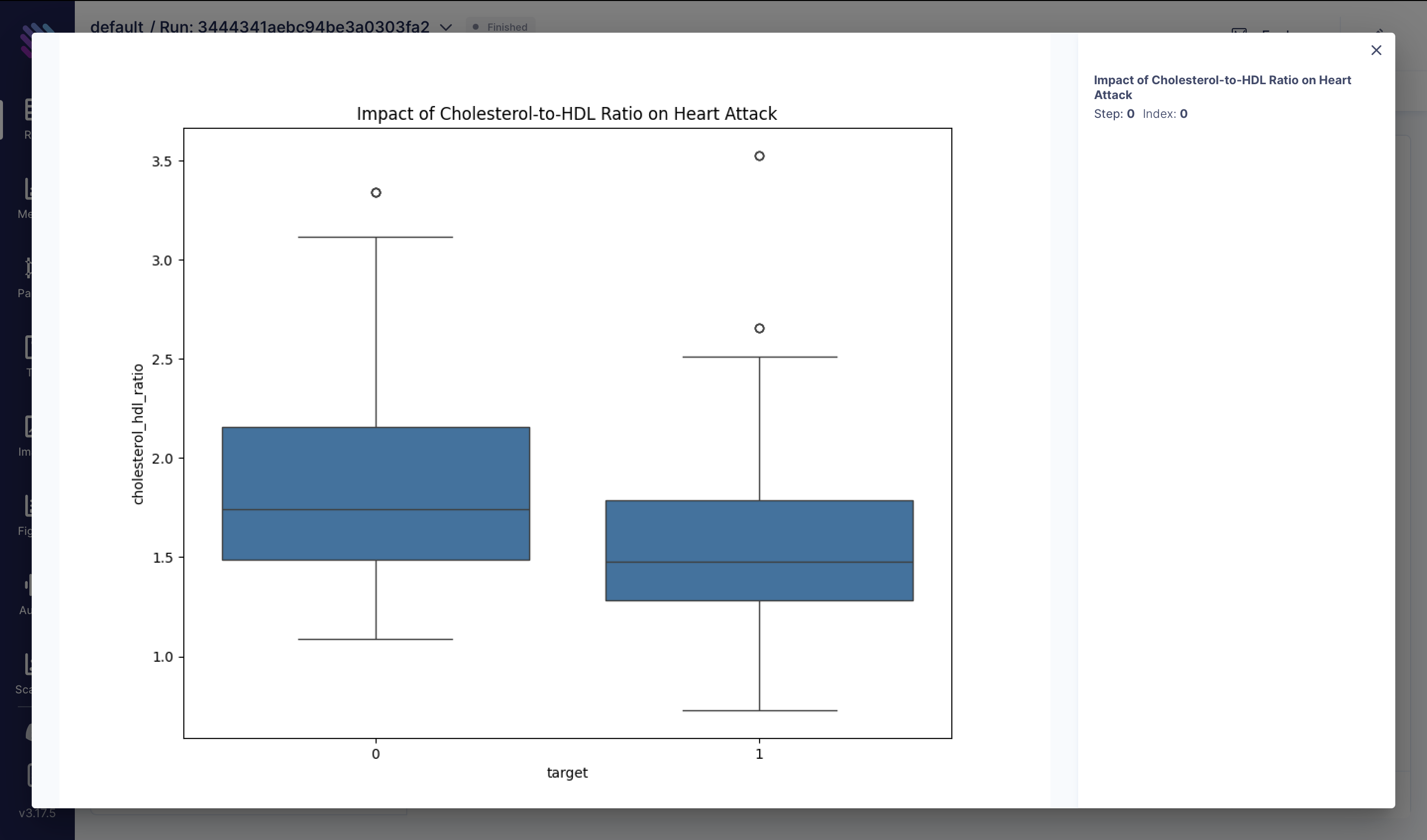
The ratio of total cholesterol (chol) to high-density lipoprotein (HDL) cholesterol is a critical marker of cardiovascular health. A higher ratio may indicate an increased risk of heart disease. Here, we analyze the distribution of cholesterol-to-HDL ratios among individuals with and without heart attacks:
df["cholesterol_hdl_ratio"] = df["chol"] / df["thalach"]
fig = plt.figure(figsize=(10, 8))
sns.boxplot(x="target", y="cholesterol_hdl_ratio", data=df)
plt.title("Impact of Cholesterol-to-HDL Ratio on Heart Attack")
aim_img = Image(fig)
run.track(aim_img, name="Impact of Cholesterol-to-HDL Ratio on Heart Attack")
These visualizations provide insights into various factors influencing heart attack risk and can aid in developing strategies for prevention and treatment.
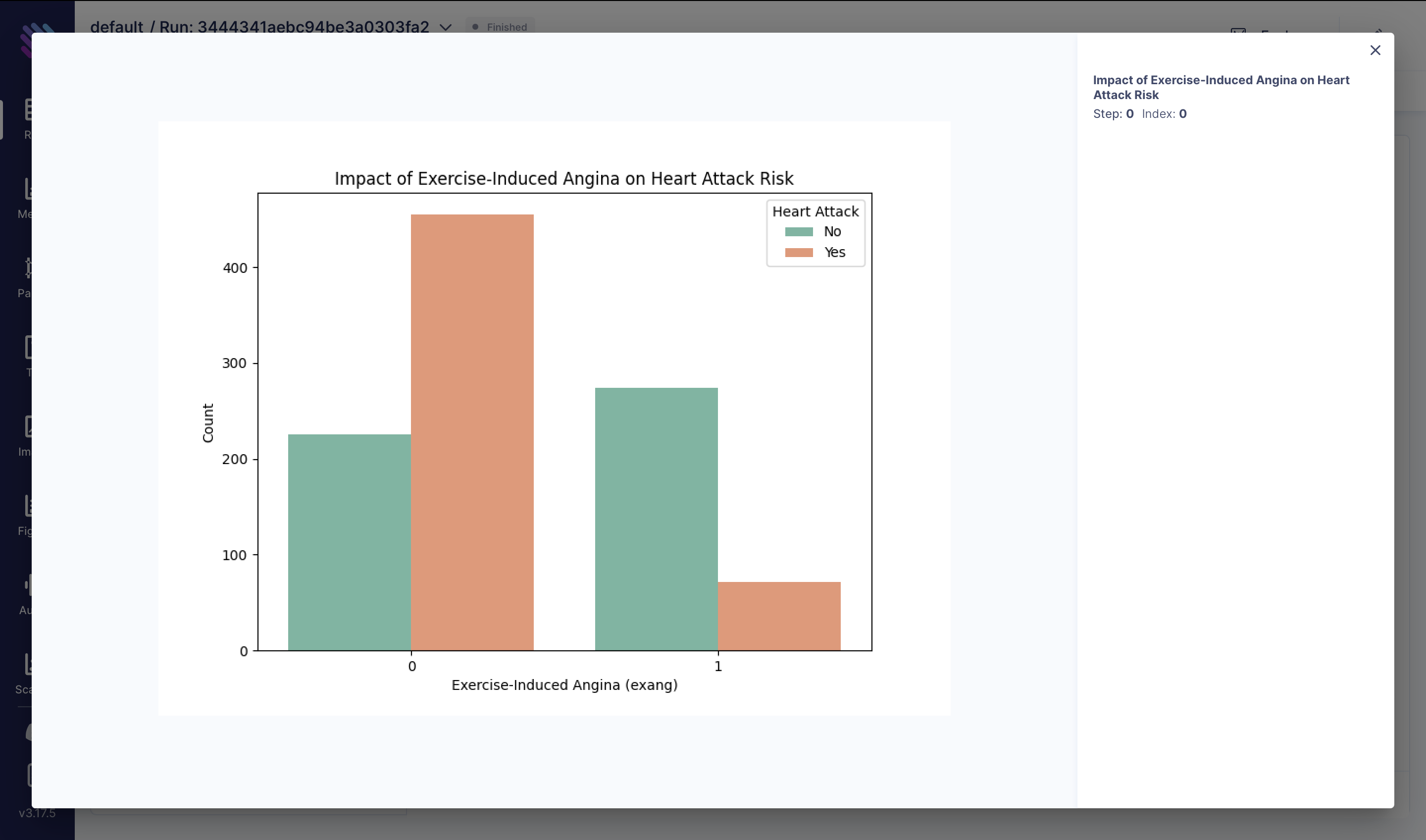
Exercise-induced angina can be a symptom of underlying heart conditions. In this analysis, we explore how the presence or absence of exercise-induced angina affects the likelihood of experiencing a heart attack:
fig = plt.figure(figsize=(8, 6))
sns.countplot(x="exang", hue="target", data=df, palette="Set2")
plt.title("Impact of Exercise-Induced Angina on Heart Attack Risk")
plt.xlabel("Exercise-Induced Angina (exang)")
plt.ylabel("Count")
plt.legend(title="Heart Attack", labels=["No", "Yes"])
aim_img = Image(fig)
run.track(aim_img, name="Impact of Exercise-Induced Angina on Heart Attack Risk")
These visualizations provide insights into various factors influencing heart attack risk and can aid in developing strategies for prevention and treatment.
Training Models to Predict Heart Attack
In our pursuit to predict heart attack risk, we’re going to train three simple machine learning algorithms using the provided features from the dataset.
X = df[["age", "sex", "chol", "trestbps", "thalach", "exang", "oldpeak"]]
y = df["target"]

# Split the dataset into training and testing sets
X_train, X_test, y_train, y_test = train_test_split(
    X, y, test_size=0.2, random_state=42
)

scaler = StandardScaler()
X_train_scaled = scaler.fit_transform(X_train)
X_test_scaled = scaler.transform(X_test)
Let's dive into each model and examine their performance.
Logistic Regression
We kickstart our analysis with the classic Logistic Regression model:
Lr_model = LogisticRegression(random_state=42)
Lr_model.fit(X_train_scaled, y_train)
y_pred = Lr_model.predict(X_test_scaled)

accuracy = accuracy_score(y_test, y_pred)
conf_matrix = confusion_matrix(y_test, y_pred)
classification_rep = classification_report(y_test, y_pred)

print(f"Accuracy: {accuracy:.2f}")
run.track(accuracy, name="accuracy", context={"model": "logistic_regression"})

print(f"Confusion Matrix: {conf_matrix}")
fig = plt.figure(figsize=(10, 8))
sns.heatmap(conf_matrix, annot=True, cmap="RdYlGn", linewidths=0.5, fmt="g")
plt.title("Prediction Confusion Matrix: LogisticRegression")
aim_img = Image(fig)
run.track(
    aim_img,
    name="Prediction Confusion Matrix",
    context={"model": "logistic_regression"},
)

print(f"Classification Report: {classification_rep}")
run["classification_report-logistic_regression"] = classification_report(y_test, y_pred, output_dict=True)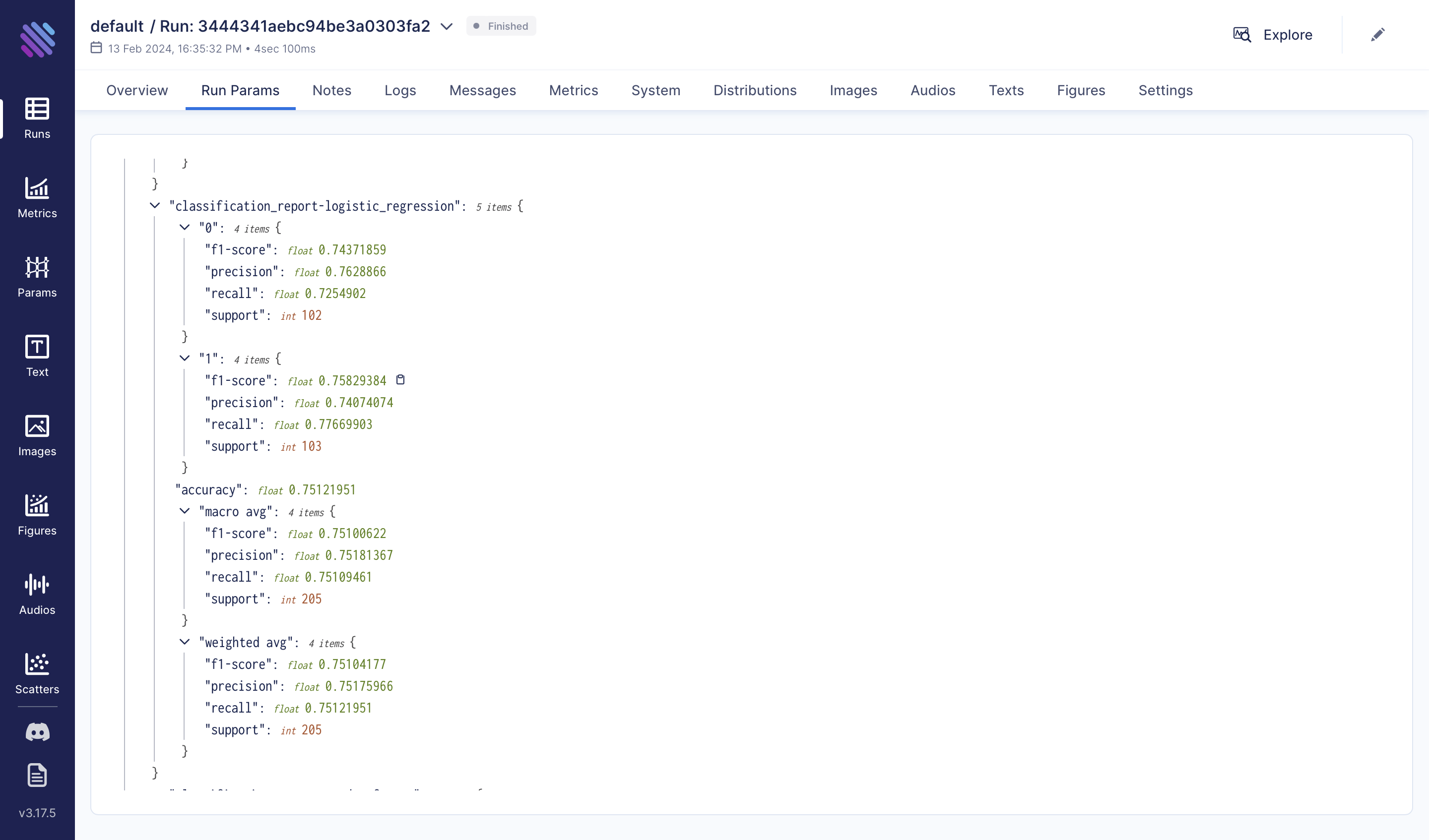
Random Forest Algorithm
Moving forward, let's explore the Random Forest algorithm:
from sklearn.ensemble import RandomForestClassifier

rfmodel = RandomForestClassifier(random_state=42)
rfmodel.fit(X_train, y_train)
y_pred = rfmodel.predict(X_test)

accuracy = accuracy_score(y_test, y_pred)
conf_matrix = confusion_matrix(y_test, y_pred)
classification_rep = classification_report(y_test, y_pred)

print(f"Accuracy: {accuracy:.2f}")
run.track(accuracy, name="accuracy", context={"model": "random_forest_classifier"})

print(f"Confusion Matrix: {conf_matrix}")
fig = plt.figure(figsize=(10, 8))
sns.heatmap(conf_matrix, annot=True, cmap="RdYlGn", linewidths=0.5, fmt="g")
plt.title("Prediction Confusion Matrix: RandomForestClassifier")
aim_img = Image(fig)
run.track(
    aim_img,
    name="Prediction Confusion Matrix",
    context={"model": "random_forest_classifier"},
)

print(f"Classification Report: {classification_rep}")
run["classification_report-random_forest"] = classification_report(y_test, y_pred, output_dict=True)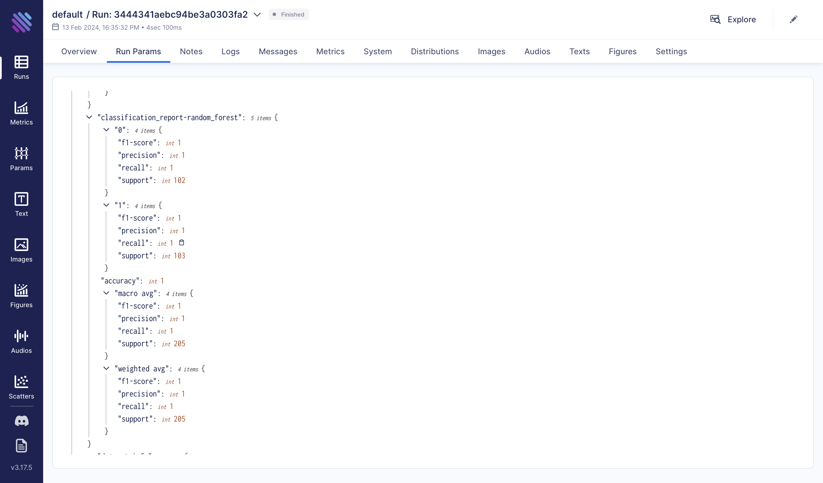
Decision Tree
Lastly, let's delve into the Decision Tree algorithm:
from sklearn.tree import DecisionTreeClassifier

dt_model = DecisionTreeClassifier(random_state=42)
dt_model.fit(X_train, y_train)
y_pred = dt_model.predict(X_test)

accuracy = accuracy_score(y_test, y_pred)
conf_matrix = confusion_matrix(y_test, y_pred)
classification_rep = classification_report(y_test, y_pred)

print(f"Accuracy: {accuracy:.2f}")
run.track(accuracy, name="accuracy", context={"model": "decision_tree_classifier"})

print(f"Confusion Matrix: {conf_matrix}")
fig = plt.figure(figsize=(10, 8))
sns.heatmap(conf_matrix, annot=True, cmap="RdYlGn", linewidths=0.5, fmt="g")
plt.title("Prediction Confusion Matrix: DecisionTreeClassifier")
aim_img = Image(fig)
run.track(
    aim_img,
    name="Prediction Confusion Matrix",
    context={"model": "decision_tree_classifier"},
)

print(f"Classification Report: {classification_rep}")
run["classification_report-decision_tree"] = classification_report(y_test, y_pred, output_dict=True)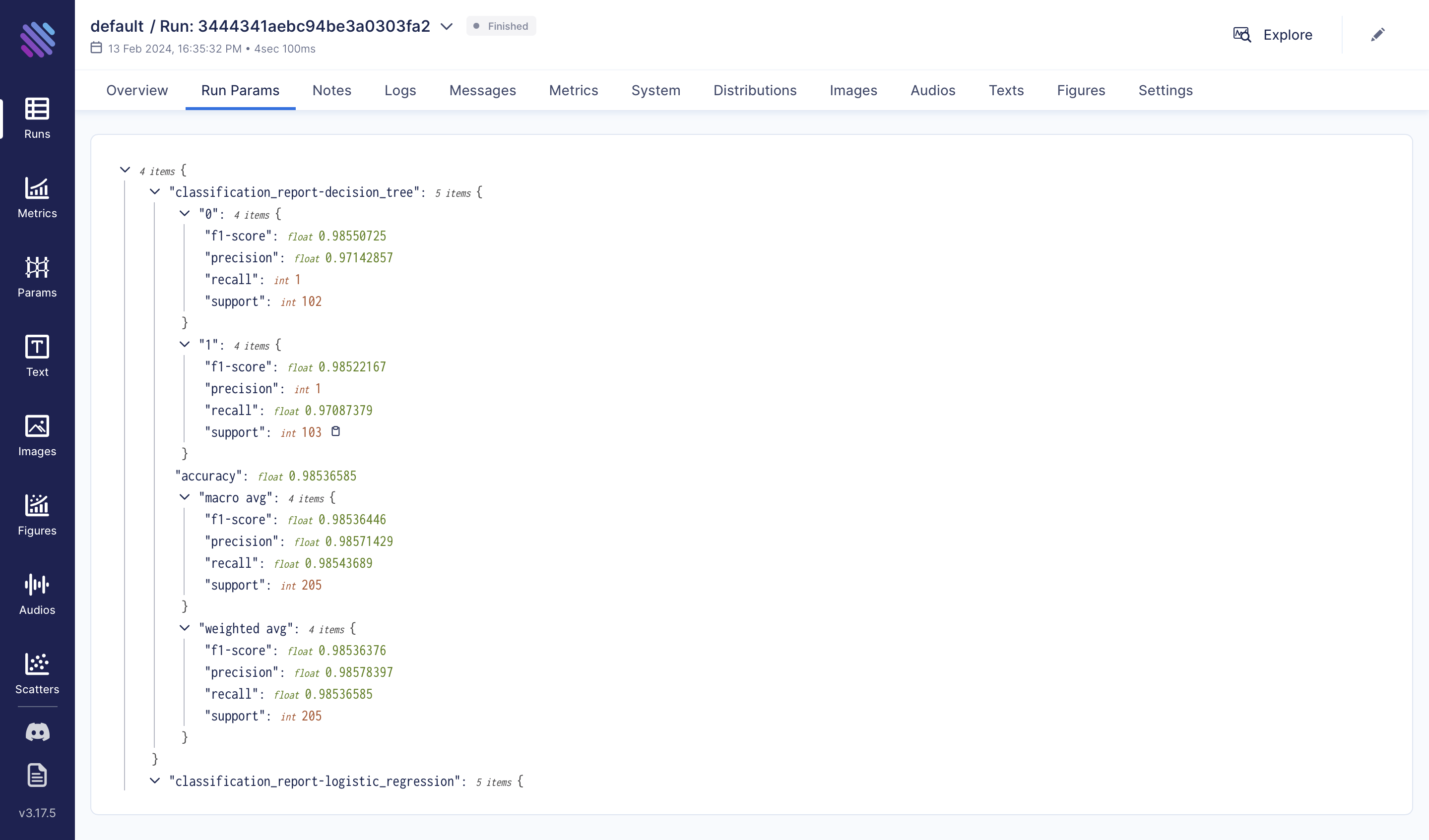
Post-Training Analysis
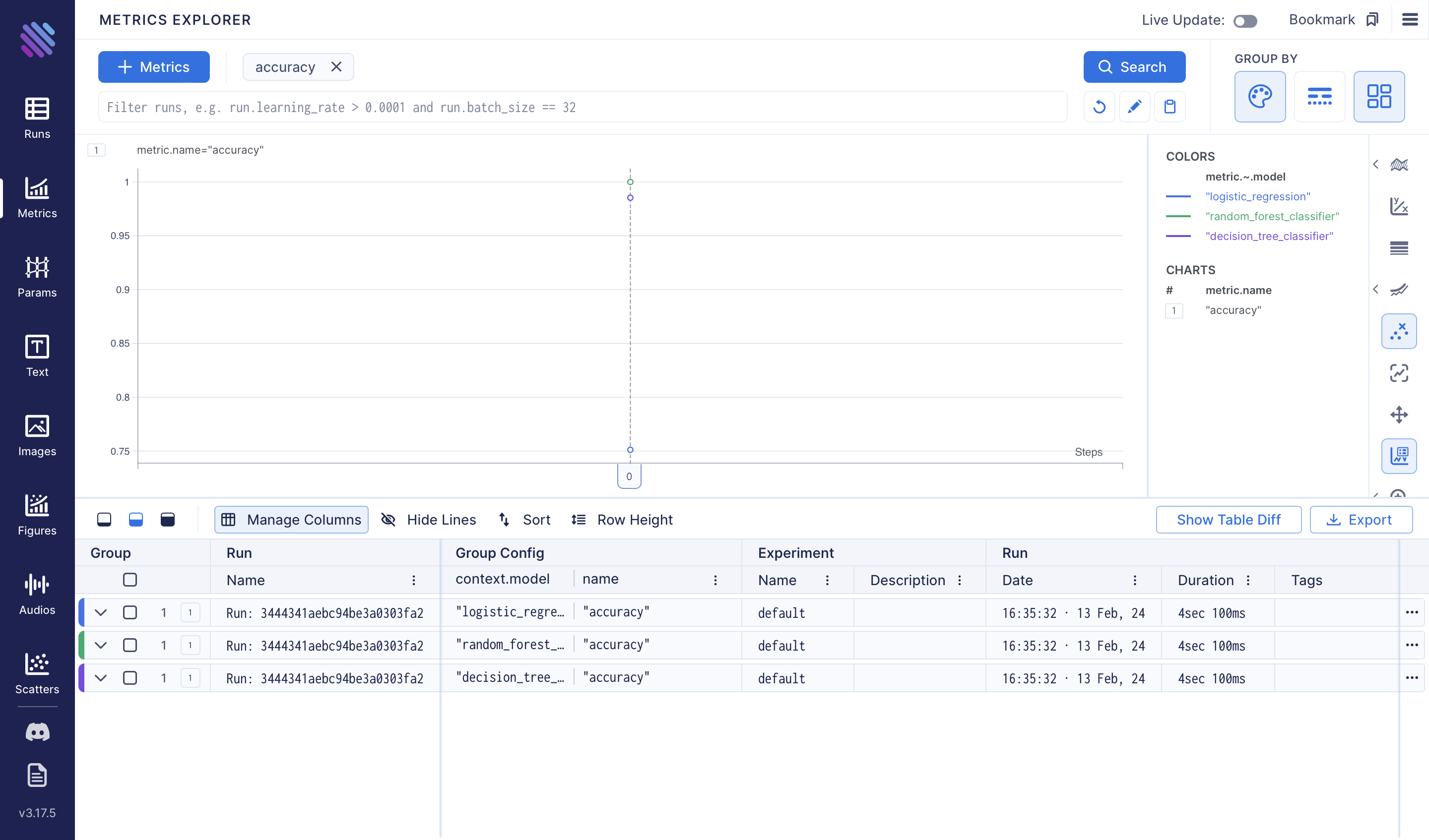
To assess the accuracies of the three models we've trained, we can use the Metrics Explorer:
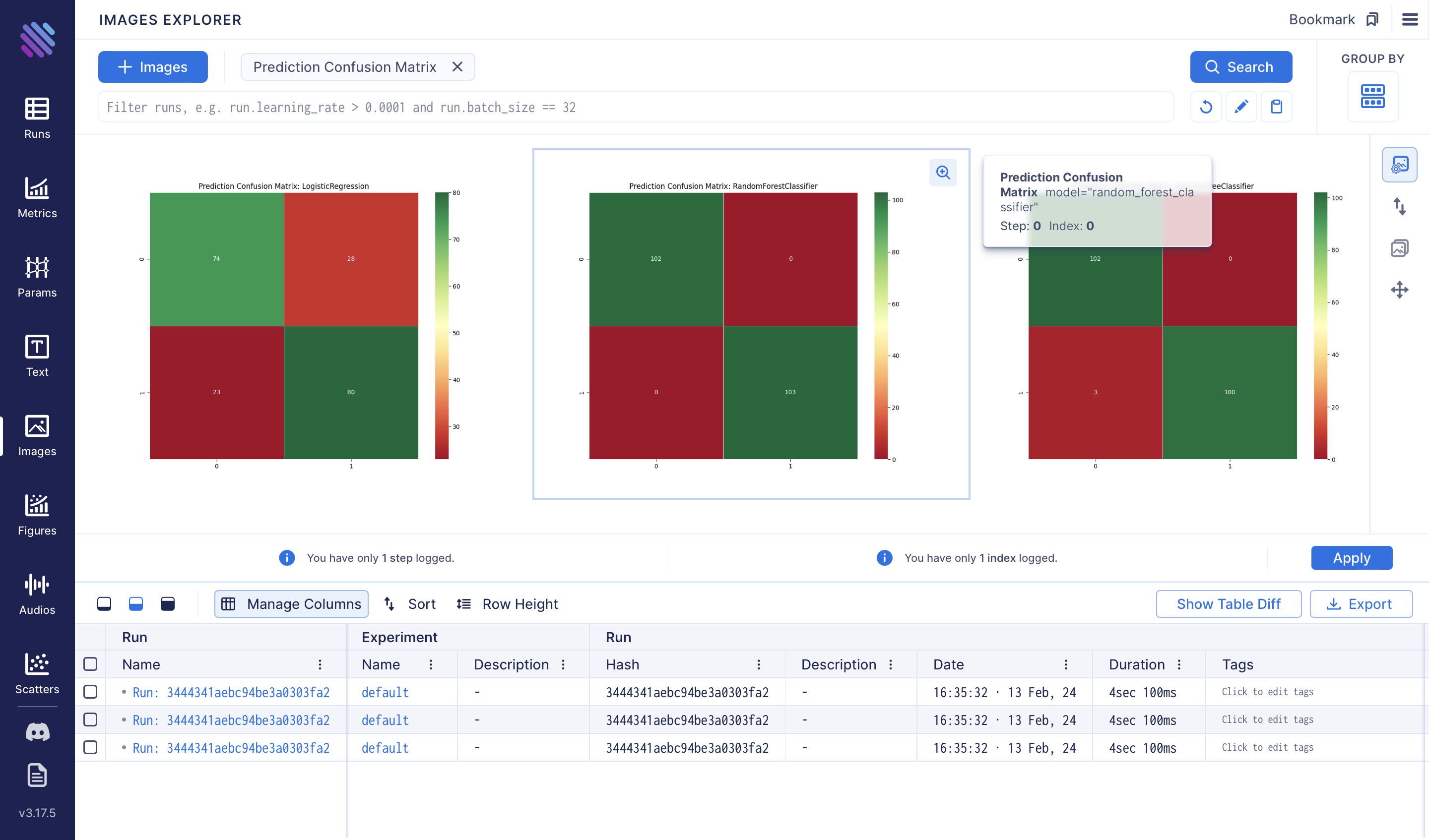
Additionally, we can compare the confusion matrices of each method using the Images Explorer:
To comprehend the importance of each feature provided by the Random Forest classifier, we conduct the following analysis:
feature_importances = rfmodel.feature_importances_

feature_names = X.columns

feature_importance_df = pd.DataFrame(
    {"Feature": feature_names, "Importance": feature_importances}
)

feature_importance_df = feature_importance_df.sort_values(
    by="Importance", ascending=False
)

fig = plt.figure(figsize=(10, 6))
sns.barplot(x="Importance", y="Feature", data=feature_importance_df, palette="viridis")
plt.title("Feature Importances in Predicting Heart Attacks")
plt.xlabel("Importance")
plt.ylabel("Feature")
aim_img = Image(fig)
run.track(aim_img, name="Feature Importances in Predicting Heart Attacks")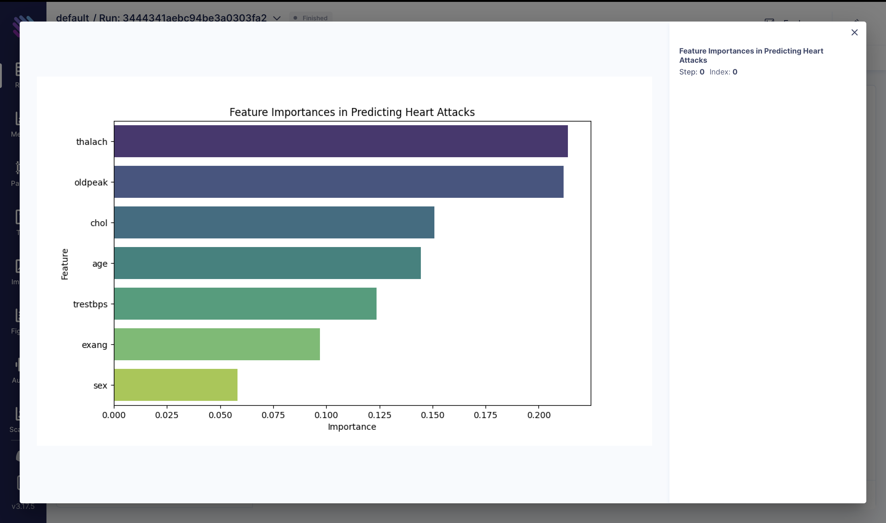
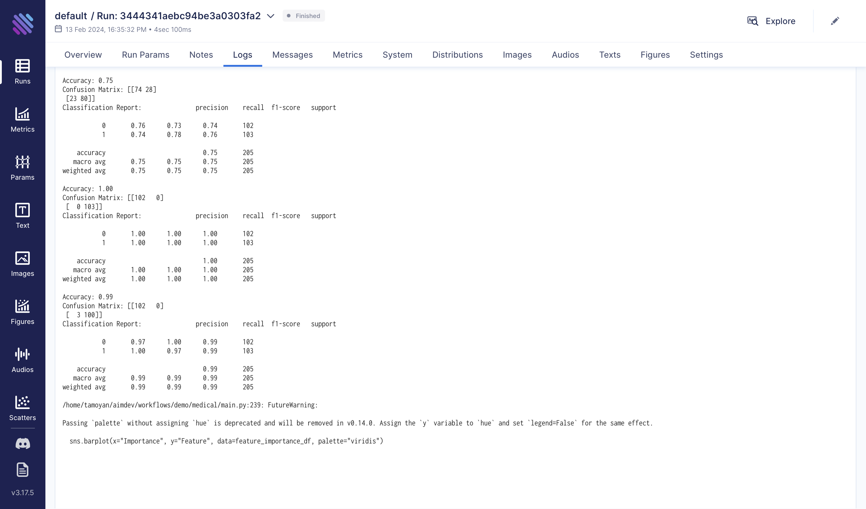
For more details, the process can be reviewed in the 'Logs' tab. For long and expensive experiments, the benefits are greater:
Conclusion
In wrapping up our exploration of heart attack prediction, we dove deep into the factors affecting heart health through machine learning.
Our study showed how picking the right features and checking our models are super important for guessing heart attack chances well. We used Aim, a cool tool that helps track experiments. It's known for being easy to use and giving quick results. With Aim, we kept track of what we found while studying. The things we learned could help doctors and policymakers make better plans to help patients avoid heart attacks.
We used Aim to track every step and insight, showcasing its value in biomedical research. For more on Aim's features, check out aimstack.io or GitHub repository.
Learn more
Aim is on a mission to democratize AI dev tools. 🙌
Try out Aim, join the Aim community, share your feedback.